Workshop 03: HTML and Bootstrap
- Introduction
- Part 0: Initial setup
- Part 1: Hello, Bootstrap!
- Part 2: Facebook in Bootstrap
- Submission
Introduction
Developers write website GUIs using HTML and CSS. As we discussed in class, these technologies are becoming increasingly difficult to use directly. Websites must work across different browsers (Chrome/Safari/Internet Explorer), operating systems (Windows/Mac/Linux), and devices (desktop/smartphone/tablet). Managing this complexity can be quite difficult!
In this class, you will use Bootstrap to write your website GUI. Bootstrap provides you with useful HTML and CSS primitives for writing website GUIs that work across desktop, tablet, and mobile. Wikipedia summarizes Bootstrap quite well:
Bootstrap is a free and open-source collection of tools for creating websites and web applications. It contains HTML- and CSS-based design templates for typography, forms, buttons, navigation and other interface components, as well as optional JavaScript extensions. It aims to ease the development of dynamic websites and web applications.
In this workshop, you will use Bootstrap to write basic, non-interactive website GUIs. By the end of the workshop, you should have a decent idea of what is possible using Bootstrap, and how to apply Bootstrap to your group project.
Specifically, you will:
- Learn about HTML
- Learn about CSS
- Learn how to use Bootstrap
- Write the next Facebook in Bootstrap!
- …OK, that’s an overstatement. We’re going to create a rough version of Facebook’s layout.
We will not have time to cover the following topics, but we encourage students to explore them on their own:
- Responsive design
- Compatibility with ancient web browsers (IE8, IE7, etc)
- These web browsers are becoming increasingly irrelevant.
Part 0: Initial setup
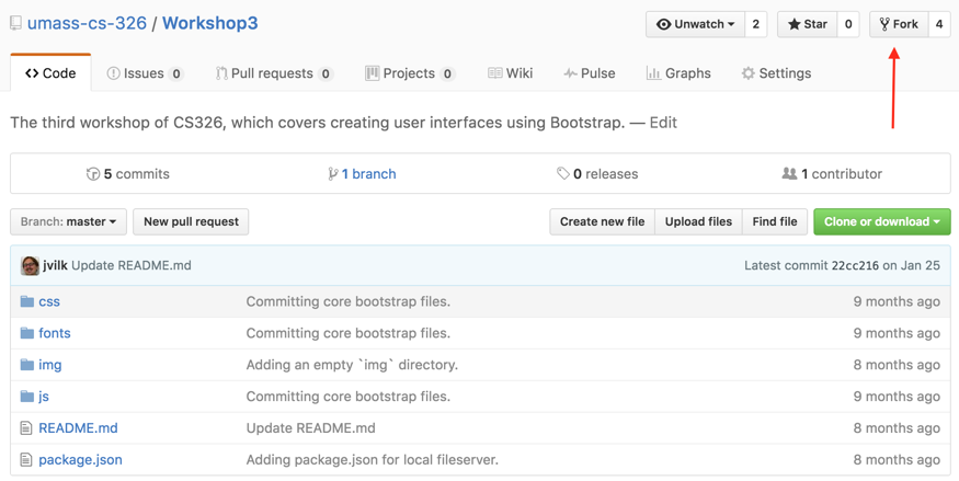
To get started you need to fork the GitHub repository for this workshop. To do that click on the “Fork” button, it is on the upper right-hand part of the github page next to “Unwatch” and “Star”. The repository contains the version of Bootstrap we will be using (v3.3.6) and a basic script that runs a local web server:
Clone the repository into your class folder, cd, into it, and
run the following command to install a basic web server:
npm install
This command will create a node_modules folder, which you should leave alone.
It contains the web server.
Run the following command to start the local web server, which will let you view the HTML you produce in a web browser:
npm run serve
Note: If you have a firewall installed, you will need to approve Node.js to open port 8080 on the network. Most firewalls will ask you immediately.
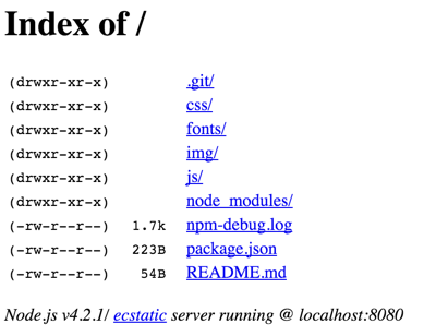
Navigate your web browser to http://localhost:8080/, which should look something like this:
Keep that console window open for the entirety of the workshop. When you close that window, the web server stops! Open a second console window and navigate to the workshop git repository directory so you can run other commands while the server runs.
Part 1: Hello, Bootstrap!
Let’s get familiar with Bootstrap by writing a simple “Hello World!” webpage.
This workshop’s git repository has the following directories:
css/: A folder to put CSS files into. Currently contains a few Bootstrap CSS files. You can add new CSS files to this directory, but do not modify the Bootstrap CSS files. We will describe how to customize the look of Bootstrap the proper way.fonts/: Bootstrap contains a number of Glyphicons that you are free to use in your website. Thefontsdirectory contains web font files containing these Glyphs. Since Bootstrap works on every browser, it maintains these fonts in several formats. Do not modify these files.img/: A folder to put your images into.js/: Contains Bootstrap’s JavaScript dependencies.
You will put all HTML files into the root of the repository.
Create the file helloworld.html in the root of the repository, and put the
following HTML into it:
<!DOCTYPE html>
<html lang="en">
  <head>
    <meta charset="utf-8">
    <meta http-equiv="X-UA-Compatible" content="IE=edge">
    <meta name="viewport" content="width=device-width, initial-scale=1">
    <!-- The above 3 meta tags *must* come first in the head;
	     any other head content must come *after* these tags -->
    <title>Bootstrap 101 Template</title>

    <!-- Bootstrap's CSS -->
    <link href="css/bootstrap.min.css" rel="stylesheet">
  </head>
  <body>
    <!-- All of your HTML will go between here.... -->
    <h1>Hello, world!</h1>

    <!-- ...and here. -->
    <!-- jQuery (necessary for Bootstrap's JavaScript plugins) -->
    <script src="js/jquery.min.js"></script>
    <!-- Include all compiled plugins (below),
	     or include individual files as needed -->
    <script src="js/bootstrap.min.js"></script>
  </body>
</html>
You will use this same boilerplate code for all of your Bootstrap projects.
Navigate to http://localhost:8080/helloworld.html, and you should see the following:

Add helloworld.html to Git, commit it, and push to GitHub
A walk through helloworld.html, aka “what are those tags for?”
tl;dr: Bootstrap handles all of this stuff so you can focus on making cool websites.
Most of the HTML here is pretty standard
(e.g. the
html tag,
head tag,
body tag,
etc)… but some of the elements are confusing. Let’s discuss them
now!
The following is a document type declaration:
<!DOCTYPE html>
Roughly, these tell the web browser how to interpret the document. The web has gone through many iterations, and so older documents on the web are displayed slightly differently than newer ones. This doctype is the HTML5 doctype, which is what you should generally use on all of your websites.
The template contains a block of meta tags, which are somewhat interesting:
<meta charset="utf-8">
<meta http-equiv="X-UA-Compatible" content="IE=edge">
<meta name="viewport" content="width=device-width, initial-scale=1">
The first line tells the browser to interpret the rest of the document
from that point as utf-8, which is a character
encoding.
Character encodings are a rabbit hole,
but, at a high level, it tells the browser how to translate the
low-level bits of the document into language characters. Without this
tag, the web server would have to tell the browser what character
encoding to use. If it didn’t, the web browser would likely assume
ASCII, which means fun emojis like 👍 won’t display properly. tl;dr:
You generally want utf-8 at all times.
The second line tells Internet Explorer to use its new Edge rendering engine if available, which is much more standards compliant than its older rendering engines. On certain versions of IE, this tag is required to enable new browser features.
The third line is for mobile browsers; it tells the browser to render the page at the width of the device’s screen, and to start the page view at the standard zoom level. Otherwise, the browser may render the website with a different width (e.g. thinner or larger), or may use a different zoom level when it loads your website.
Finally, Bootstrap puts its script tags as the last items in the body of the
HTML file, which seems unusual if you have ever written HTML before. These tags
pull in the JavaScript files that Bootstrap relies on. We will cover these tags
later when we start covering JavaScript:
<body>
  <!-- snip -->
  <!-- jQuery (necessary for Bootstrap's JavaScript plugins) -->
  <script src="js/jquery.min.js"></script>
  <!-- Include all compiled plugins (below),
       or include individual files as needed -->
  <script src="js/bootstrap.min.js"></script>
</body>
Most HTML guides specify that script tags be added to the head of the
document. However, if Bootstrap did that, the web browser would wait until both
jquery.min.js and bootstrap.min.js downloaded and initialized before
displaying the body of the webpage. On a mobile connection, this could
translate into a multi-second wait.
By putting these tags into the body, the web browser will display all of the
content in the HTML document before the script tags while the script tags
load. This is now standard practice on most websites.
There are more modern ways to do this, but Bootstrap uses this method because it is compatible with the most web browsers.
Part 2: Facebook in Bootstrap
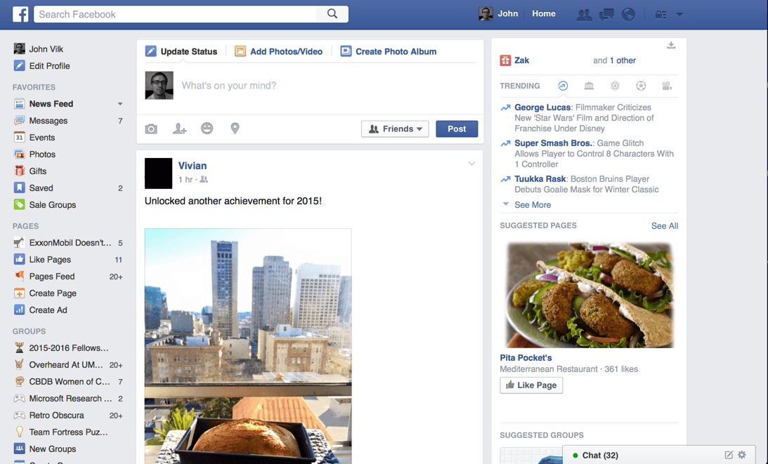
Many of you are likely familiar with Facebook. In this part of the workshop, you will recreate Facebook’s desktop interface using HTML, CSS, and Bootstrap. Facebook’s desktop interface looks like this:
For grading purposes, we are going to have you write git commits at particular points in the workshop with specific messages. We will look at your website at those commits, and check that it is correct. If you do not commit your code when the guide tells you to, or if you use a different commit message, we will have trouble grading your submission.
Let’s dive in!
Step 00: Basic Bootstrap template
Create a file called facebook.html in the root of the workshop repository with
the standard Bootstrap boilerplate we used for the Hello World example, except
with a modified title:
<!DOCTYPE html>
<html lang="en">
  <head>
    <meta charset="utf-8">
    <meta http-equiv="X-UA-Compatible" content="IE=edge">
    <meta name="viewport" content="width=device-width, initial-scale=1">
    <!-- The above 3 meta tags *must* come first in the head;
		 any other head content must come *after* these tags -->
    <title>Facebook</title>

    <!-- Bootstrap's CSS -->
    <link href="css/bootstrap.min.css" rel="stylesheet">
  </head>
  <body>
    <!-- Our Facebook layout will go here. -->

    <!-- jQuery (necessary for Bootstrap's JavaScript plugins) -->
    <script src="js/jquery.min.js"></script>
    <!-- Include all compiled plugins (below),
		 or include individual files as needed -->
    <script src="js/bootstrap.min.js"></script>
  </body>
</html>
Don’t commit anything to Git just yet; we’re going to do a bit more first!
Step 01: Facebook at the Macro Level
Now that we have a template, it’s time to work on the layout of our Facebook clone! But… Facebook’s desktop interface is quite cluttered. You may not know where to begin.
At this point, it’s important to look at the big picture. Ignore the details; what are the top-level content panes on the webpage? If we can create those properly, then we can start filling in the details of each. HTML documents are trees, so you should be able to edit the content of each content pane independently.
In other words, if you establish these content panes correctly, the size and contents of one content pane will not impact the others.
To answer my own question, there are five top-level content panes:
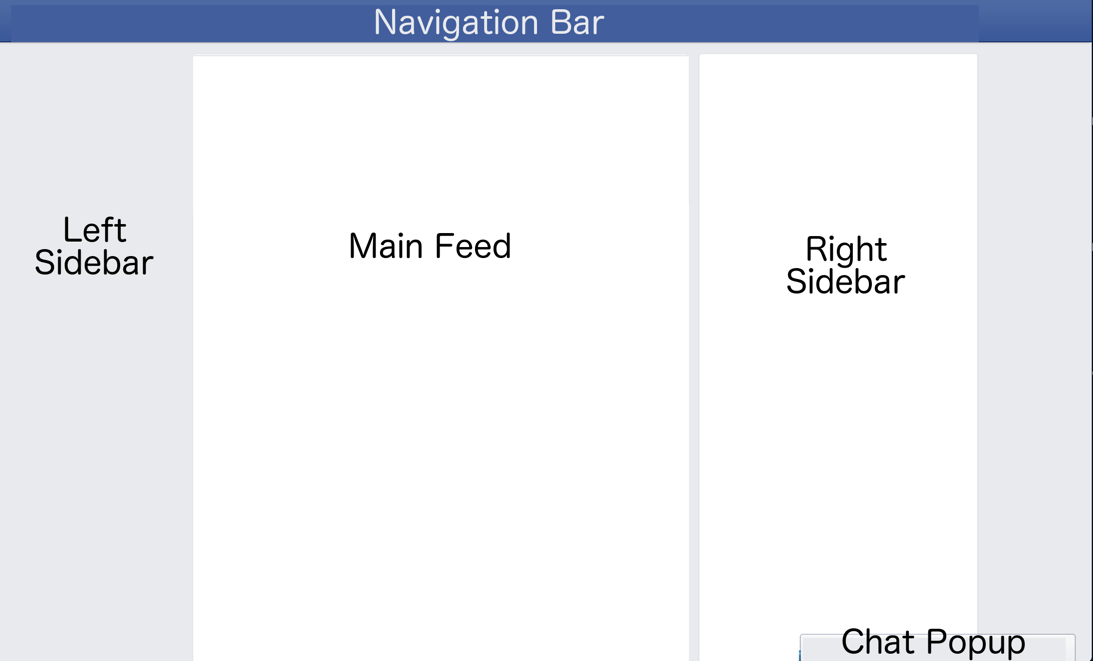
Facebook uses a three-column layout, with a top navigation bar and a chat dock in the corner. What we want to do now is create HTML for each of these using Bootstrap.
Bootstrap has two primary documentation pages for creating the layout of a website:
- CSS Guide: Documents many of the CSS classes available within Bootstrap, which you can use to style / format your GUI.
- Component Guide: Documents the components/widgets in Bootstrap. The line between components and simple CSS classes is murky at best; many components are simply CSS classes you apply to HTML elements. You’ll likely check both of these pages regularly when designing a website.
We will refer to content in both of these as you build your Facebook clone.
Basic Navbar
The component guide contains a section on how to create a navigation bar, which is absolutely perfect for the Facebook navigation bar.
In your template, add an empty Bootstrap navigation bar to the body of the
page. It should go before the script tags:
<nav class="navbar navbar-default">
  NAVBAR
</nav>
The nav HTML tag
is intended for a content pane with links to other parts of the site.
navbar and navbar-default are Bootstrap CSS classes, which transform the
ordinary HTML tag into a Bootstrap navigation bar. HTML tags can have an
arbitrary number of CSS classes applied to them. Later on, we’ll define our
own classes to customize our site further.
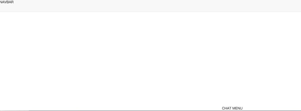
Now, if you refresh http://localhost:8080/facebook.html, you’ll see a faint gray outline of a navigation bar:

You may be tempted to fill in the navbar with buttons and such, and figure out how to make it Facebook blue… but do not do that just yet. When implementing a webpage layout, the top-level structure of a webpage is the most important detail to think through and get right. It quickly becomes frustrating if you try to change/fix the top-level structure of a fully-developed webpage, which typically contains hundreds of lines of HTML!
Three Columns
With the navbar in place, we can tackle creating the main three columns. Bootstrap has a handy grid system, which lets you place HTML elements in rows and columns. You will use this grid system regularly in your layouts.
The grid documentation contains many details, but the most important facts are:
- A grid contains a list of rows.
- Each row has 12 columns.
- Each grid cell can span 1 or more columns, can be specified for a particular
screen size, and can begin at a particular column.
- For this tutorial, we are targeting medium-size screens, so we will
only use
col-md-*CSS classes. - Bootstrap lets you make responsive designs that adapt to different screen sizes. You can define columns that span different numbers of columns for different screen sizes, and can define columns that only display for particular screen sizes. We will not cover this in this workshop, but understanding how this works is crucial for writing mobile websites in Bootstrap.
- For this tutorial, we are targeting medium-size screens, so we will
only use
- Each row is as tall as the largest cell within it, and expands to fill the width of the HTML element that contains it.
- You can nest grids within grids by defining rows within cells.
We’ll cover each of these points (and more!) as we make grids for the Facebook layout.
For the Facebook three-column layout, we can make one row with three cells: one for the left sidebar, one for the main feed, and one for the right sidebar. We just need to decide how many columns each cell spans!
To visualize the solution, here’s the Facebook layout with the Bootstrap grid columns overlaid on top:
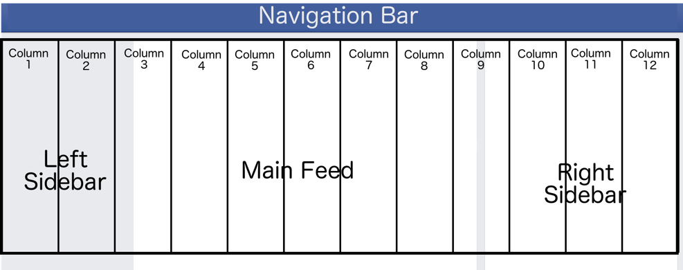
Remember: The Bootstrap grid system is always 12 columns wide, each column is equal in size, and the columns expand to fill the width of the HTML element that contains it.
The left sidebar is roughly 2 columns wide, the feed 7, and the right sidebar 3.
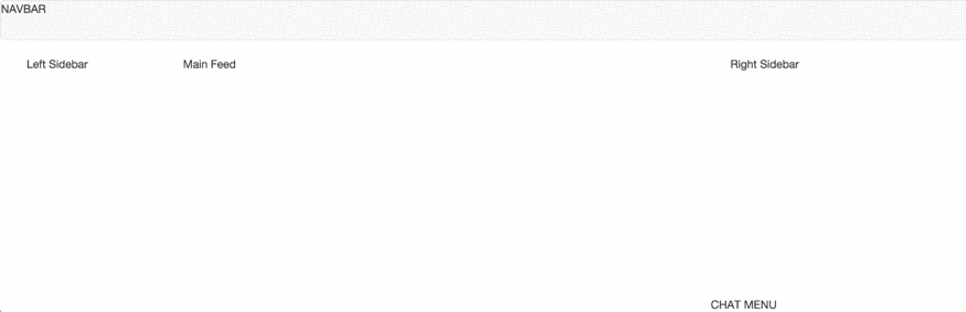
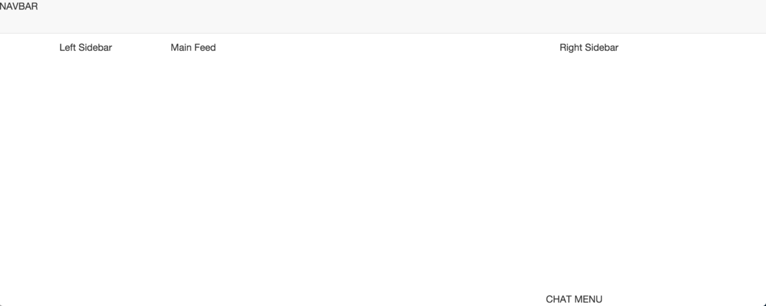
Now, we can add a simple, one-row grid to the body of our Facebook clone.
Add this just below the navbar:
<!-- The container for our grid. The outermost grid must be placed within
     a `container` or `container-fluid` class. (Meaning: If you nest a grid
     within a grid, you should not define another `container`)
     What's the difference between these two types of container? There's a
     good answer here: http://stackoverflow.com/a/22263969 -->
<div class="container">
  <!-- The row that contains the three main columns of the website. -->
  <div class="row">
    <!-- Left sidebar: A cell that spans 2 columns -->
    <div class="col-md-2">
      Left Sidebar
    </div>
    <!-- Main feed: A cell that spans 7 columns -->
    <div class="col-md-7">
      Main Feed
    </div>
    <!-- Right sidebar: A cell that spans 3 columns -->
    <div class="col-md-3">
      Right Sidebar
    </div>
  </div>
</div>
Now, our Facebook clone looks like the following:
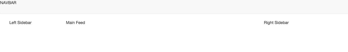
Those look like the correct proportions!
If you resize your browser window to make it wider or narrower, you’ll notice
that the width of the grid changes slightly. The container that we nested
our grid inside has several fixed widths, depending on the width of the
browser window. This is part of
Bootstrap’s responsive design, which we encourage you to read more about
if you are interested.
Also, note that your Facebook layout looks weird when the browser gets too thin. We will not address this limitation in this workshop, but there are two solutions to this problem: 1) Disabling Bootstrap’s responsiveness, or 2) Adding in extra Bootstrap CSS classes so the layout looks good on smaller screens.
Chat Popup
The final main content pane on the Facebook page is the chat popup menu. This menu docks at the bottom of the screen, and sits on top of the content on the right. How can we re-create this popup using Bootstrap?
The CSS position property
tells the browser how to render an HTML element and its children (i.e. nested elements).
We can position the chat menu using the absolute position, which instructs the
browser to display the element at a specific location relative to the browser
window. To ensure that the chat menu covers contents on the page, we can set the
CSS property z-index
to a large value. Elements with a larger z-index always cover elements with
a lower z-index.
The next question: How do we tell the browser how wide the chat menu is?
Up until now, all of our HTML elements have a width that is relative to the size
of the browser window. For example, the width of the navigation bar and the main grid depends
on the width of the container class, which depends on the size of the browser window. This is a good thing. Our layout will
display well on desktop devices with a variety of screen sizes.
Often, new web developers are tempted to micromanage every pixel on their webpages by defining pixel widths, heights, and offsets on all of their HTML elements. This is a bad idea. HTML layouts produced using this technique are:
- Unmaintainable: The HTML/CSS will be cluttered with specific pixel offsets. Adding additional content panes or altering the layout would be a considerable undertaking, as all of the pixel values affect one another.
- Inflexible: Bootstrap is designed so that your webpage can look good on many screen sizes. Using specific pixel counts restricts your webpage to looking good on only one screen size.
- Non-portable: Web browsers differ slightly in how they display webpages. It’s common that one browser will add a single extra pixel of padding between elements over another browser due to a rounding error. You cannot count on pixel-precise behavior across browsers.
However, there are exceptions to every rule. The chat menu is a small floating menu, and its contents do not vary much in width. In particular, it contains a fixed-width online indicator, text indicating how many people are online (which will be at most 8 + log 10(# online friends) characters wide), and two fixed-width buttons. We cannot rely on this content being a specific width, but we can reasonably assume that it won’t exceed a certain width.
The Facebook chat popup itself is ~300 pixels wide, which gives the content plenty of room to grow if the person has many friends online:
With that discussion out of the way, we’re going to add a div element for the
chat menu to the HTML. Before we can do that, however, we need to add a CSS
file so we can define custom CSS stylings for our website.
Create an empty file at css/facebook.css, and add the following HTML to
facebook.html within the head tag, just after the link tag for
bootstrap.min.css:
<!-- Custom CSS -->
<link href="css/facebook.css" rel="stylesheet">
Now, our webpage will load and apply facebook.css when you view it.
Open facebook.css, and add a CSS rule for the chat menu:
.chat-popup {
  width: 300px;
  position: absolute;
  bottom: 0px;
  right: 20px;
}
Note: CSS classes typically use all lowercase letters with dashes in-between words. You don’t need to follow this convention, but the rest of the web typically does.
The above is a CSS rule. A CSS rule contains a selector and a declaration block. The syntax is as follows:
SELECTOR {
  DECLARATION BLOCK
}
Our rule uses a CSS class selector,
which means “apply these properties to elements with the class chat-popup”.
Class selectors are written using a period (.) before the target class.
CSS rules can change the look and position of elements on the webpage, and are
how Bootstrap components work. The CSS rule above is only concerned with the
position of the chat menu. The value for bottom and right, when position
is set to fixed, means:
“Display this element 0 pixels from the bottom, and 30 pixels from the right”.
Add the following HTML to the body of your page, after the container div
containing the grid:
<div class="chat-popup">
  CHAT MENU
</div>
Navigate to http://localhost:8080/facebook.html, and you should see the following:
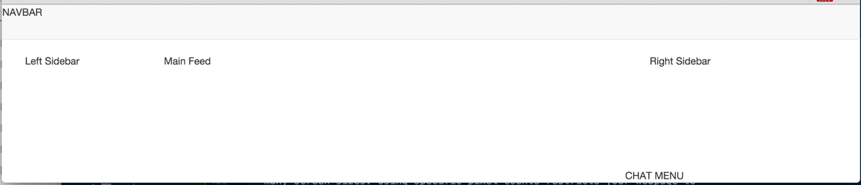
That looks about right!
add facebook.html and css/facebook.css to Git, commit your
changes with the commit message fb1, and push the changes to
GitHub.
Step 02: Scrolling Behavior
Next, we need to check how our layout responds when we have enough content to trigger scrolling. On Facebook, the main feed is larger than the browser window’s height. The user scrolls down the feed to see content hiding off-screen. As the user does this, the chat menu and top menu follows along.
Note: Facebook also makes the right sidebar follow as you scroll so you look at trending content and advertisements, but it scrolls in an odd manner. We will not cover this behavior in this workshop. Our right sidebar will not “stick” to the side of the browser window.
Let’s see how our current layout responds to content in the main feed.
Add a really tall div element to the main feed’s div, like so:
<div class="col-md-7">
  Main Feed
  <div style="height: 99999px;">

  </div>
</div>
The style attribute can be specified on any HTML element. It lets you specify
CSS stylings within the HTML. You should avoid using the style attribute,
as it clutters your HTML with styling information. You should use HTML to
organize the structure of your webpage (i.e. the HTML tree), and CSS to
customize the look given that structure.
In this example, we are adding this element temporarily to investigate
scrolling behavior, so we are justified in using style.
Navigate to http://localhost:8080/facebook.html and try scrolling… and… you’ll discover there are some problems:
The chat menu and navigation bar should stay “attached” to the browser window as you scroll, but they don’t. Why is that?
Chat Menu
We used position: absolute; to place the menu, which places the menu relative
to the browser window. However, the menu does not stay in place when you scroll!
(It does, however, stay in place when you resize the window to make it longer.
Weird, right?)
Instead, we need to use position: fixed;, which fixes the element relative
to the user’s current view of the webpage. Fix the CSS for the chat-popup
class, and reload the page:
Much better!
The link we posted earlier mentions these differences, but it’s much easier to understand when you see it in-person. (Also, full disclosure: we made this mistake ourselves when creating this assignment.)
Navigation Menu
Considering the chat menu solution, you may be tempted to make the nav element
absolutely placed, and call it a day. You can certainly fix the problem that
way, but it’s much easier to use Bootstrap’s built-in CSS class that does it
for you.
Add the navbar-fixed-top CSS class to your nav element, and reload the page.
The navigation bar is now docked at the top… but it’s also covering the three
main columns!
To fix this, we can simply offset the content of the body by a particular
pixel amount. Add the following to facebook.css:
body {
  padding-top: 60px;
}
This CSS rule uses a type selector,
which applies the rule to all elements of the specified type.
This particular CSS rule applies its properties to every body element on the
webpage. Now, the browser will add 60 pixels worth of padding above the body
element. Since the navbar and chat content panels are placed relative
to the browser’s viewport (effectively floating above the webpage), they are
not impacted by this change.
We chose 60 pixels for the offset because the Bootstrap example code for a fixed navbar uses a similar value. The navbar is apparently ~50 pixels high by default, and we can rely on this value remaining constant.
Now, all is well!
commit your changes with the commit message fb2, and push the changes to GitHub.
Step 03: The Navigation Bar
With a solid page structure in place, we can start adding buttons and content to flesh out the layout.
Facebook’s navigation bar looks like the following:

Notice that one half of the navigation bar is left-aligned (the logo + search box), and the other half is right-aligned, with empty space pooling in the middle.
Bootstrap’s default example for a navigation bar uses the same basic design. We can repurpose this sample code to imitate Facebook’s navigation bar. In addition, we can use Bootstrap’s Glyphicons to imitate all of Facebook’s icons.
First, let’s empty out the sample code from that link into its essentials, and modify it to use a “home” glyphicon for the brand logo:
<nav class="navbar navbar-fixed-top navbar-default">
  <!-- ".container-fluid" expands to fill the entire browser view's width.
       ".container" will use the same width as the ".container" in the body,
       which contains the three columns of content.

       We want ".container" here so the navbar is the same width as the content.

       Confused? Try switching between the two container classes once you have a
       complete navbar to see the difference. -->
  <div class="container">
    <!-- This code is only active when viewing the site on mobile. We will not
         cover responsive design, but we'll leave this in, as it's part of the
         example code.-->
    <div class="navbar-header">
      <button type="button" class="navbar-toggle collapsed" data-toggle="collapse"
		      data-target="#bs-example-navbar-collapse-1" aria-expanded="false">
        <span class="sr-only">Toggle navigation</span>
        <span class="icon-bar"></span>
        <span class="icon-bar"></span>
        <span class="icon-bar"></span>
      </button>
      <!-- Use a "home" glyphicon as a logo. -->
      <a class="navbar-brand" href="#">
        <!-- This is how you display a glyphicon. -->
        <span class="glyphicon glyphicon-home"></span>
      </a>
    </div>

    <!-- On mobile, this div is hidden by default. The user hits the button
         in the `navbar-header` to see the content of the div.
         On desktop, this div is visible all of the time. -->
    <div class="collapse navbar-collapse" id="bs-example-navbar-collapse-1">
      <form class="navbar-form navbar-left" role="search">
        <!-- Left-aligned items. -->
      </form>
      <ul class="nav navbar-nav navbar-right">
        <!-- Right-aligned items. -->
      </ul>
    </div><!-- /.navbar-collapse -->
  </div><!-- /.container -->
</nav>
Now, your navigation bar will have a house icon in the corner, instead of the Facebook logo.
Next, let’s add in the search bar. The example code already had one in there, but it didn’t look quite right. Bootstrap’s documentation has an example input field with an attached button. We can use this code, and modify the button to display the “search” Glyphicon.
Modify the form element to include the search bar:
<form class="navbar-form navbar-left" role="search">
  <!-- Left-aligned items. -->
  <div class="input-group">
    <input type="text" class="form-control" placeholder="Search Facebook">
    <span class="input-group-btn">
      <button type="submit" class="btn btn-default">
        <span class="glyphicon glyphicon-search"></span>
      </button>
    </span>
  </div>
</form>
Next, the right-hand side of the navigation bar has 7 different buttons spread among 4 button groups (the picture + name are a single button). The final button is a dropdown.
Bootstrap has support for button groups, including various types of dropdown buttons and putting multiple button groups into a single toolbar. We can use the sample code from the Bootstrap guide to craft the buttons we need.
The original navbar example code used a ul element for the right hand side
of the navbar, which is an unordered list. Typically, ul is used to make
bulleted lists. Modern websites abuse it to place many different HTML elements
side-by-side, since you can eliminate the bullet point and change the behavior
of ul via CSS.
ul is not an appropriate element for the right-hand-side of our navigation
bar, since we’ll be using a button toolbar to group things together.
Change the ul element above into a div, like so:
<div class="nav navbar-nav navbar-right">
  <!-- Right-aligned items -->
  <div class="btn-toolbar pull-right" role="toolbar">
    <div class="btn-group" role="group">
      <button type="button" class="btn btn-default">
        John
      </button>
    </div>
    <div class="btn-group" role="group">
      <button type="button" class="btn btn-default">
        Home
      </button>
    </div>
    <div class="btn-group" role="group">
        <button type="button" class="btn btn-default">
          <span class="glyphicon glyphicon-user"></span>
        </button>
        <button type="button" class="btn btn-default">
          <span class="glyphicon glyphicon-comment"></span>
        </button>
        <button type="button" class="btn btn-default">
          <span class="glyphicon glyphicon-globe"></span>
        </button>
    </div>
    <div class="btn-group" role="group">
      <button type="button" class="btn btn-default">
        <span class="glyphicon glyphicon-lock"></span>
      </button>
      <div class="btn-group" role="group">
        <button type="button" class="btn btn-default dropdown-toggle"
			    data-toggle="dropdown">
          <span class="caret"></span>
        </button>
        <ul class="dropdown-menu">
          <li><a href="#">Log out...</a></li>
        </ul>
      </div>
    </div>
  </div>
</div>
Notice that the above HTML is entirely composed of Bootstrap sample code. All we did was replace the text of the buttons with different text or a Glyphicon.
Now if you look at the navbar, it’ll look mostly right… but there’s an issue with how the buttons display! They are bunched up toward the top of the screen:

Ideally, we’d like these to be vertically aligned within the navbar. The Bootstrap documentation discusses this issue, and has a solution:
Add the
.navbar-btnclass to<button>elements not residing in a<form>to vertically center them in the navbar.
Apply this fix to every button element in the navbar (except for the search
button – since that’s within a form!), and the navbar will look as you’d expect:

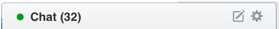
When you get a notification, friend request, or message, Facebook adds a number beside the appropriate button in the navigation bar. Bootstrap supports this functionality; it calls these numbers “badges”.
Add badges to the notification, friend request, and message buttons:
<div class="btn-group" role="group">
  <button type="button" class="btn btn-default">
    <span class="glyphicon glyphicon-user"></span>
    <span class="badge">5</span>
  </button>
  <button type="button" class="btn btn-default">
    <span class="glyphicon glyphicon-comment"></span>
    <span class="badge">1</span>
  </button>
  <button type="button" class="btn btn-default">
    <span class="glyphicon glyphicon-globe"></span>
    <span class="badge">3</span>
  </button>
</div>
Next, the search bar is a little too small. Facebook uses a 395px wide search bar. We can create a CSS class for the search bar, and make it 395 pixels wide.
Add the following to facebook.css:
.fb-search {
  width: 395px;
}
Add the fb-search class to the input tag for the search bar and… it
doesn’t do anything! Why is this?
If you are using Google Chrome, you can right-click the search bar, and click on
Inspect to open up Chrome’s developer tools. It will show you that Chrome
is ignoring our width setting, since it is set already in the Bootstrap
class form-control:
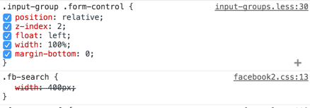
We can tell the web browser to make fb-search’s width setting override
form-control’s by marking it !important. Using !important is
generally not recommended, as it makes your CSS hard to debug, but sometimes it
cannot be avoided. In this case, we do not want to modify Bootstrap, yet we want
to change its behavior for this one case.
You use !important on individual properties, like so:
.fb-search {
  width: 395px !important;
}
Now, your navigation bar should look like the following:

The navbar is now complete! Later, we’ll revisit the navbar to make it look more like Facebook.
commit your changes with the commit message fb3, and push the changes to GitHub.
Submission
You must submit the URL of your Workshop3 GitHub repository to Moodle. Visit Moodle, find the associated Workshop 3 activity, and provide your URL. Make sure your Workshop3 repository is public so we can clone your repository and evaluate your work.