Workshop 04: Facebook Static Structure
Introduction
This workshop continues from where Workshop 03 left off. You do not need to clone a new repository you simply begin in the repository you cloned for Workshop 03.
Step 04: The Left Sidebar
The left sidebar of Facebook contains a laundry list of destinations:
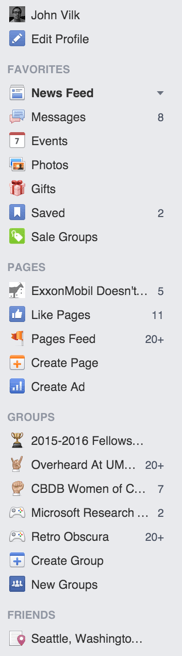
We’ll emulate a truncated version of this list in Bootstrap that omits the specific groups and pages that I belong to.
We could implement this list using a Bootstrap grid, but there’s an easier solution built into Bootstrap.
Notice that the News Feed item in the list is bolded. The user can only be in one of these destinations at once, which will populate the Main Feed section of the site. The active destination is bolded.
Bootstrap provides this functionality via pills. While pills look visually different from Facebook’s sidebar, the concept behind the UI control is the same.
Like before, we’ll use the closest Glyphicon for each of the icons in the list:
<!-- Left sidebar: A cell that spans 2 columns -->
<div class="col-md-2">
  <ul class="nav nav-pills nav-stacked">
    <li role="presentation"><a href="#">John Vilk</a></li>
    <li role="presentation">
      <a href="#"><span class="glyphicon glyphicon-pencil"></span>
	  Edit Profile</a>
    </li>
    <!-- List items that are just text are not indented, and look like the
         Facebook section labels. -->
    <li role="presentation">FAVORITES</li>
    <!-- The class "active" highlights this item in the list -->
    <li role="presentation" class="active">
      <a href="#"><span class="glyphicon glyphicon-list-alt"></span>
	  News Feed</a>
    </li>
    <!-- We can use badges in pills to add numbers beside them. -->
    <li role="presentation">
      <a href="#">
        <span class="glyphicon glyphicon-comment"></span> Messages
		<span class="badge">7</span>
      </a>
    </li>
    <li role="presentation">
      <a href="#"><span class="glyphicon glyphicon-calendar"></span>
	  Events</a>
    </li>
    <li role="presentation">
      <a href="#"><span class="glyphicon glyphicon-picture"></span>
	  Photos</a>
    </li>
    <li role="presentation">
      <a href="#"><span class="glyphicon glyphicon-gift"></span>
	  Gifts</a>
    </li>
    <!-- "Saved" also has a number beside it. -->
    <li role="presentation">
      <a href="#">
        <span class="glyphicon glyphicon-bookmark"></span>
		Saved
		<span class="badge">2</span>
      </a>
    </li>
    <li role="presentation">
      <a href="#"><span class="glyphicon glyphicon-tags"></span>
	  Sale Groups</a>
    </li>
    <li role="presentation">PAGES</li>
    <li role="presentation">
      <a href="#"><span class="glyphicon glyphicon-plus"></span>
	  Create Page</a>
    </li>
    <li role="presentation">
      <a href="#"><span class="glyphicon glyphicon-signal"></span>
	  Create Ad</a>
    </li>
    <li role="presentation">GROUPS</li>
    <li role="presentation">
      <a href="#"><span class="glyphicon glyphicon-plus"></span>
	  Create Group</a>
    </li>
    <li role="presentation">
      <a href="#"><span class="glyphicon glyphicon-user"></span>
	  New Groups</a>
    </li>
    <li role="presentation">FRIENDS</li>
    <li role="presentation">
      <a href="#"><span class="glyphicon glyphicon-pushpin"></span>
	  Amherst, MA</a>
    </li>
  </ul>
</div>
Notice how we use # as the target of the anchor (a) elements.
Anchor tags are used to link to a webpage, e.g.:
<a href="https://google.com">Click here to go to Google!</a>
… will look like this: Click here to go to Google!.
Using # as the target of an anchor prevents the webpage from loading a new
page when the user clicks the link. If the user clicks the link, the webpage
will change the URL of the page from http://localhost:8080/facebook.html to
http://localhost:8080/facebook.html#, but will not do anything else. You can
also add arbitrary text after the #, e.g. #groups, and the browser will
rewrite the URL to http://localhost:8080/facebook.html#groups.
Ordinarily, these URLs are used to link to particular sections of a webpage.
For example, the link http://getbootstrap.com/css/#type will bring your browser
to the Typography section of the Bootstrap documentation. If you clicked that
same link on the http://getbootstrap.com/css/ page, it would merely scroll
your browser to the Typography section without reloading the webpage.
If the section doesn’t exist,
e.g. http://getbootstrap.com/css/#flying_pigs, the # part of the
link does nothing. In the next workshop, we’ll explore how you can
exploit this behavior to make portions of a dynamic website
linkable, like this Google.com easter egg which is not a specific
section of Google.com:
https://www.google.com/#q=a+long+time+ago+in+a+galaxy+far+far+away
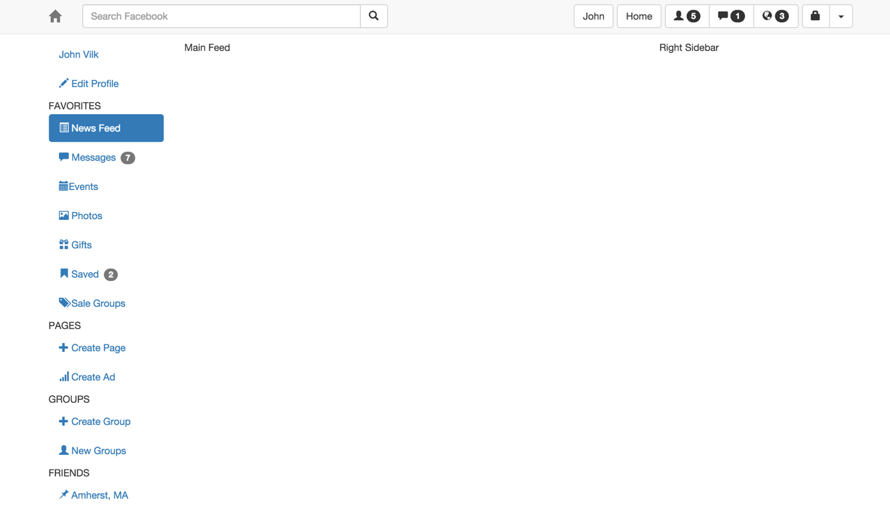
Now, your left sidebar should look quite nice:
Since that was rather straightforward, you do not have to commit your changes just yet. Proceed to the next step.
Step 05: The Right Menu
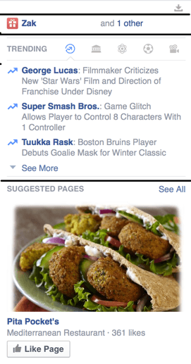
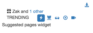
The right sidebar contains birthday information, trending events, and advertisements:
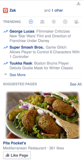
Mmm… Pita Pockets… (This course is not affiliated with Pita Pockets.)
This sidebar can be recreated using a grid. As we discussed earlier, you can nest grids within grids. Every nested grid has its own 12 columns, which expand to fill the width of the element containing it. Since the right sidebar is so small, every column is quite tiny!
We can make a grid with one column of 12-column-wide cells, and nest content inside it. Initially, you may be tempted to create the rows in the grid like so:
This grid configuration will work, and will produce the intended visuals. However, this structure betrays the structure of the information contained in the sidebar. The “trending” widget should be contained within one element, as should the “suggested pages” widget.
If you structure your HTML according to the information displayed, you will be able to:
- Apply custom CSS styles to specific widgets without impacting other sidebar components.
- Make the content of the widget dynamic, as we’ll discuss in the next workshop.
- Easily identify what HTML belongs to the “Trending” widget in a large HTML document.
Thus, instead, we will structure the sidebar grid like so:
Now, you can flesh out your right sidebar with a skeleton:
<!-- Right sidebar: A cell that spans 3 columns -->
<div class="col-md-3">
  <!-- Nested grid! Like the outer grid, it's just a sequence of rows. -->
  <!-- Ticker -->
  <div class="row">
    Ticker widget
  </div>
  <!-- Birthday -->
  <div class="row">
    Birthday widget
  </div>
  <!-- Trending -->
  <div class="row">
    Trending widget
  </div>
  <!-- Suggested pages -->
  <div class="row">
    Suggested pages widget
  </div>
</div>
The ticker widget is the little download icon in the top-right corner of the sidebar.
Clicking it expands the ticker. For this workshop, we will not cover the
expanding functionality, and will just make it a static link using the download-alt glyphicon.
By default, HTML elements display from left to right, but we want the ticker button
to display all of the way to the right. Bootstrap has a helper CSS class called
pull-right that we can
apply to items within grids. Thus, specify the ticker like so:
<!-- Ticker. -->
<div class="row">
  <div class="col-md-12">
    <a href="#" class="pull-right">
      <span class="glyphicon glyphicon-download-alt"></span>
    </a>
  </div>
</div>
Note that we do not add pull-right to the table cell. We apply it to the element within the table cell.
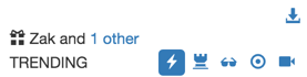
The birthday widget is fairly easy; use a glyphicon birthday cake and some text within a 12-column-wide cell:
<!-- Birthday -->
<div class="row">
  <div class="col-md-12">
    <span class="glyphicon glyphicon-gift"></span>
	<a href="#">Zak</a> and <a href="#">1 other</a>
  </div>
</div>
The trending widget is the most complex widget on this sidebar. We can use another Bootstrap grid for its internal structure:
<!-- Trending -->
<div class="row">
  <div class="col-md-12">
    <div class="row">
      <div class="col-md-12">
        Buttons
      </div>
    </div>
    <div class="row">
      News content.
    </div>
  </div>
</div>
The widget has a sequence of buttons, of which one is active at a time. Can you recall a Bootstrap component that works in this manner?
We can use Bootstrap’s pills component once more. They are visually different from Facebook’s buttons, but that can be overcome later using CSS.
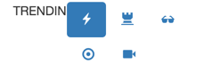
Since the widget header contains a “TRENDING” label along with the buttons, we can use a nested row with two cells: one for the label, and one for the pills. On Facebook, the TRENDING label is roughly 1/4 of the width of the sidebar, but Bootstrap’s elements are generally larger, so we can allocate it 1/3 of the 12 columns (4) and the rest of the columns to the buttons:
<!-- Trending -->
<div class="row">
  <div class="col-md-12">
    <div class="row">
      <div class="col-md-4">
        TRENDING
      </div>
      <div class="col-md-8">
        <ul class="nav nav-pills">
          <li role="presentation" class="active">
            <a href="#"><span class="glyphicon glyphicon-flash"></span></a>
          </li>
          <li role="presentation"><a href="#">
			  <span class="glyphicon glyphicon-tower"></span>
			  </a></li>
          <li role="presentation"><a href="#">
			  <span class="glyphicon glyphicon-sunglasses"></span>
			  </a></li>
          <li role="presentation"><a href="#">
			  <span class="glyphicon glyphicon-record"></span>
			  </a></li>
          <li role="presentation"><a href="#">
			  <span class="glyphicon glyphicon-facetime-video"></span>
			  </a></li>
        </ul>
      </div>
    </div>
  </div>
</div>
The result is structured roughly correctly, but is too wide to fit into the sidebar!
Right-clicking a pill item and clicking Inspect in Chrome shows that
Bootstrap adds a lot of padding to the anchor elements (the a elements) within the
pills:
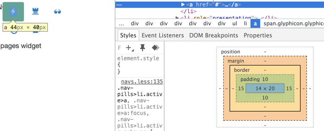
Now might be a good time for you to read up on the CSS box model, which defines what the content/padding/border/margin areas are.
We can alter the padding ourselves via CSS. While we could define a custom CSS class and apply it to each link in the trending widget, there’s a much easier way!
We can use a CSS descendent selector
to apply stylings to particular elements that are contained within other
elements. In particular, we want to alter the padding of a elements within
ul elements with the nav class within the trending widget. Add the class fb-trending to the
12-column-wide cell containing the entire trending widget, and then add the
following CSS rule to facebook.css:
/* Style applies to a elements within ul elements with class nav within
   an element with class fb-trending */
.fb-trending ul.nav a {
  padding-left: 5px;
  padding-right: 5px;
  padding-top: 2px;
  padding-bottom: 2px;
}
Note: Above, we combined type and class selectors when we specified ul.nav. This means “select ul elements with class nav.”
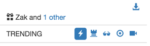
Now, the trending header looks a little closer to Facebook’s:
Next, the buttons should be right-aligned. Do you remember how to do this? Add
the pull-right CSS class to the ul element containing the buttons, and they
will line up starting from the right-hand-side of the sidebar.
Now, you may notice that the TRENDING label isn’t aligned with the buttons. In HTML/CSS,
vertically aligning content is hard to do.
In this example, we know that the pills are a particular height because 1) the
glyphicons are a particular size, and 2) we set the padding to a specific
amount. They are always 24 pixels high. Text, like “TRENDING”, is vertically
aligned to the middle of a line of text. The height of a line of text is
controlled via the line-height CSS properly.
We can set the line-height for this element to 24px, which will result in
text that happens to be vertically aligned with our 24 pixel high buttons.
Add the class fb-trending-title to the col-md-4 containing the “TRENDING”
text, then add the following CSS rule to facebook.css:
.fb-trending-title {
  line-height: 24px;
}
Note: It’s unfortunate that we had to do this. Now, if you change the height of the buttons, you’ll need to manually fix this “magic value” to fix alignment.
Now, TRENDING should be vertically aligned:
We can use CSS to add a top and bottom border around these buttons, like on
Facebook. We only want to apply the border to the first row of the fb-trending
div, which contains the buttons.
We can do this using a child selector and CSS pseudo-classes.. The child selector is similar to the descendent selector, except it only applies to elements that are direct children. You can remember this by thinking of family tries: a child is a direct descendent of two people, and anyone below a person is that person’s descendent.
Pseudo-classes are harder to summarize; we recommend you take a look at
Mozilla Development Network’s
article for more information. The :first-child pseudo-class
applies to targets that are the first child.
Putting it all together, we can target first-born row elements to fb-trending
with the selector .fb-trending > .row:first-child, add a top and bottom
border, add a little bit of padding between the buttons and the border, and
add margin space between the border and the content above/below the border:
.fb-trending > .row:first-child {
  border-top: 1px solid lightgrey;
  border-bottom: 1px solid lightgrey;
  /* Padding is the whitespace between the content of fb-trending and its
     border */
  padding-top: 5px;
  padding-bottom: 5px;
  /* Margin is the whitespace between the border and adjacent elements */
  margin-top: 5px;
  margin-bottom: 5px;
}
Confused about border/padding/margin? Read more about the CSS box model.
Your border should look like this:
Next, we tackle the content of the trending widget!
The contents of the trending widget could be expressed as a grid:
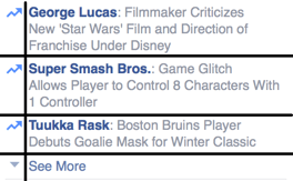
However, a grid is ill-suited for this list. The cell containing the lightning bolt is more than 1 column wide, but less than 2 columns wide. A grid would create excess whitespace between the lightning bolt and the news item, and would look like this:
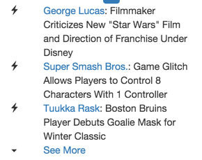
Bootstrap has a better option called a media object. Each media object can have some type of arbitrarily-sized media to the left, and text to the right. The text can contain a header, but that is optional.
The media objects can be in a list, which is perfect for the trending widget. For this list, we want the lightning bolts on the left, and the news item on the right. Adapt the sample code for the media list for our news items:
<div class="row">
  <div class="col-md-12">
    <ul class="media-list">
      <li class="media">
        <div class="media-left media-top">
          <span class="glyphicon glyphicon-flash"></span>
        </div>
        <div class="media-body">
          <a href="#">George Lucas</a>: Filmmaker Criticizes New
			  "Star Wars" Film and Direction of Franchise Under
			  Disney
        </div>
      </li>
      <li class="media">
        <div class="media-left media-top">
          <span class="glyphicon glyphicon-flash"></span>
        </div>
        <div class="media-body">
          <a href="#">Super Smash Bros.</a>: Game Glitch Allows
			  Players to Control 8 Characters With 1 Controller
        </div>
      </li>
      <li class="media">
        <div class="media-left media-top">
          <span class="glyphicon glyphicon-flash"></span>
        </div>
        <div class="media-body">
          <a href="#">Tuukka Rask</a>: Boston Bruins Player
			  Debuts Goalie Mask for Winter Classic
        </div>
      </li>
      <li class="media">
        <div class="media-left media-top">
          <span class="caret"></span>
        </div>
        <div class="media-body">
          <a href="#">See More</a>
        </div>
      </li>
    </ul>
  </div>
</div>
Note: For the “See More” icon, we use Bootstrap’s caret, which is not a Glyphicon.
The result looks great!
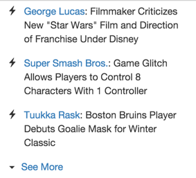
Recall that Facebook’s widget is more compressed, with less whitespace between
items. Where is the extra whitespace between list items coming from? Using
Chrome’s developer tools once again, we can Inspect the list, which uncovers
that the media class adds margin space to the top of list items:
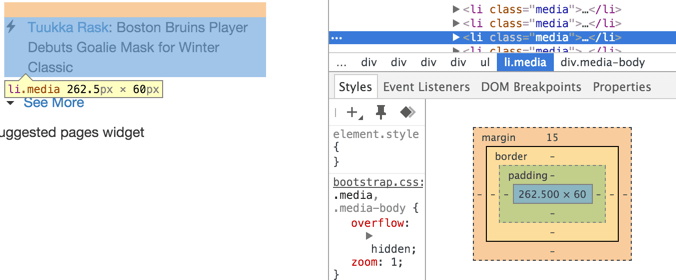
A quick CSS rule can fix that issue:
.fb-trending .media {
  margin-top: 5px;
}
Also, add a final CSS rule to create a bottom border for the entire trending widget:
.fb-trending {
  border-bottom: 1px solid lightgrey;
}
Now, the trending widget is complete! Your right sidebar should now look like this:
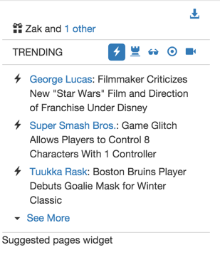
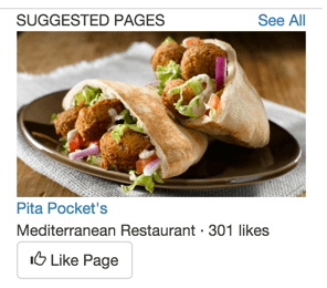
There’s one final widget to tackle: The Suggested Pages widget.
We could put everything into a grid cell, but notice how everything below
“Suggested Pages” is left-aligned. There is no fancy formatting. We can lump
all of that in a single grid cell, and use HTML line breaks (<br>) to put
content onto new lines. Line breaks are generally useful when you need to
add a line between inline HTML elements,
which typically flow like text. (Block-level elements
are the other side of the coin; they typically exist on their own lines.)
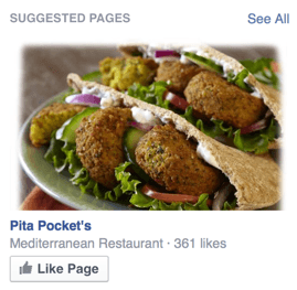
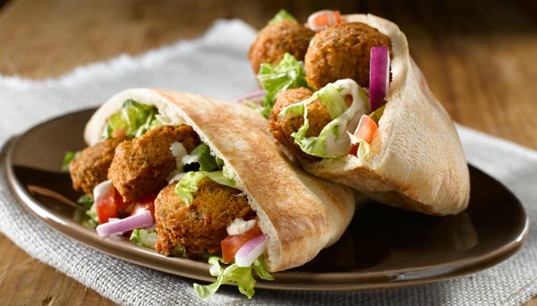
First, download
this
image of falafel,
and add it to your repository as img/falafel.jpg:
Then, add the following HTML for the “Suggested Pages” widget:
<!-- Suggested Pages -->
<div class="row">
  <div class="col-md-12">
    <div class="row">
      <div class="col-md-8">
        SUGGESTED PAGES
      </div>
      <div class="col-md-4">
        <a href="#" class="pull-right">See All</a>
      </div>
    </div>
    <div class="row">
      <div class="col-md-12">
        <img src="img/falafel.jpg" width="100%" />
        <br><a href="#">Pita Pocket's</a>
        <br> Mediterranean Restaurant · 301 likes
        <br><button type="button" class="btn btn-default">
		<span class="glyphicon glyphicon-thumbs-up">
		</span> Like Page</button>
      </div>
    </div>
  </div>
</div>
Note that all of the tags we used within the column are inline elements.
That’s why <br> works so well for this widget.
The end result looks pretty nice, but we need some whitespace between the trending widget and the suggested pages widget; that border is a little too close:
Modify your .fb-trending rule in facebook.css by adding the property
margin-bottom: 5px;. This will add space between the trending widget’s bottom
border and the suggested pages widget. (Astute readers who read up on the box
model may note that we could have added 5px of padding-top or margin-top to
the suggested pages widget instead.)
Your final right sidebar should look like this:
add img/falafel.jpg to your Git repository, commit your
changes with message fb5, and push your changes to GitHub. Note
that this changeset includes both the left and right sidebar!
Step 06: The Chat Menu
The chat menu is quite simple looking:
We can recreate this with a Bootstrap grid with two cells: One for left-aligned content (the online indicator & text), and the second for right-aligned content (the buttons).
Note that the chat menu is floating, and is thus outside of the container we
defined for the body. Bootstrap requires that grids be placed
inside an element with class container or container-fluid.
container is one of four fixed widths depending on the size of your screen.
This table contains a listing of
container widths. For example, if your browser window is < 1200 pixels wide,
but greater than 992 pixels wide, container will have a total width of
970 px. We used container on the body of the webpage; notice how the
webpage does not change its width when you make subtle changes to the browser
window’s width.
container-fluid always expands to fill the width of the element that contains
it. We did not use container-fluid on the body of our webpage, since the
width of our content would expand to fit the entire browser window; Facebook
does not exhibit this behavior, and has whitespace to the sides when the
browser window is sufficiently wide.
The chat menu is floating above the page, and its grid should expand to fill
the width of the chat menu. Thus, we put its grid into a container-fluid
container, and divide up its columns between the left and right-aligned items:
<div class="chat-popup">
  <div class="container-fluid">
    <div class="row">
      <div class="col-md-8">
        Left
      </div>
      <div class="col-md-4">
        Right
      </div>
    </div>
  </div>
</div>
The chat menu will now look like this, ignoring the drop shadow that my Mac puts on all of my desktop windows:

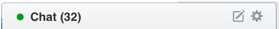
The left side can just contain the text “● Chat (32)”, with “●” having the color
green. (There are many Unicode symbols that you
can use in your website since your HTML contains a meta tag that marks your
HTML document’s character set as Unicode with 8-bit code units – aka utf-8. :) )
To color “●” green, we can encapsulate it inside of a span tag
with a class applied to it. You should use span tags whenever you need to
style inline content (i.e. content that is part of a line of items).
MDN has a great writeup about inline elements like span, and how they differ from block-level elements
like div.
Define a CSS rule that styles things green:
.green {
  color: green;
}
Then, add the text to the left-hand-side of the chat menu!
<div class="col-md-8">
  <span class="green">●</span> Chat (32)
</div>
The right-hand-side of the menu is comprised of multiple buttons. Unlike the buttons in the navigation bar, these buttons are quite small. Bootstrap has button sizes, so we can define a group of extra small buttons for the right-hand-side:
<div class="col-md-4">
  <div class="btn-group pull-right" role="group">
    <button type="button" class="btn btn-xs">
      <span class="glyphicon glyphicon-pencil"></span>
    </button>
    <button type="button" class="btn btn-xs">
      <span class="glyphicon glyphicon-asterisk"></span>
    </button>
  </div>
</div>
Your chat menu should look like this now (ignoring the drop shadow again):

Facebook’s chat menu has a border with rounded edges. CSS supports these through the border-radius attribute. The chat menu should have a border on the top, left, and right sides only, and rounded corners on the top left and top right.
Rather than define separate top, left, and right borders, we can define a
border for all sides with border and remove it from the bottom by setting
border-bottom to none. Modify your chat-popup CSS rule from before to
include the border properties:
.chat-popup {
  width: 300px;
  position: fixed;
  bottom: 0px;
  right: 20px;
  /* Applies the given border style to all sides. */
  border: 1px solid #000;
  /* Removes the border on the bottom. */
  border-bottom: none;
  border-top-left-radius: 3px;
  border-top-right-radius: 3px;
}
Your final chat menu should look like the following:

Since that wasn’t too difficult, don’t commit your changes just yet. We’re going to tackle the main feed next!
Submission
You must submit the URL of your Workshop3 GitHub repository to Moodle. Visit Moodle, find the associated Workshop 4 activity, and provide your URL. Make sure your Workshop3 repository is public so we can clone your repository and evaluate your work. Note: you are submitting your Workshop3 repository URL to the Workshop 4 activity because this is a continuation from workshop 3.