Workshop 05: Facebook Feed and Styling
Introduction
This workshop continues from where Workshop 04 left off. You do not need to clone a new repository you simply begin in the repository you used for Workshop 04.
Step 07: The Feed
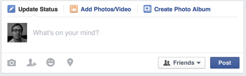
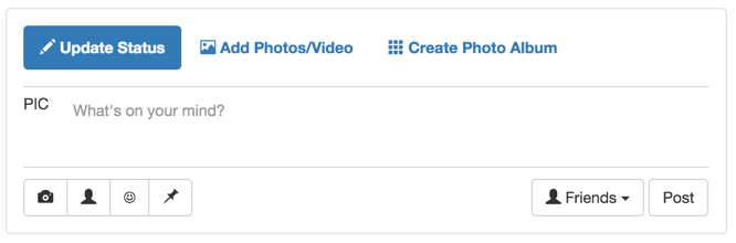
The feed contains a status update entry form at the top, like this:
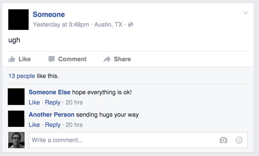
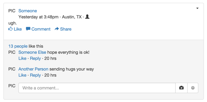
…and a list of Facebook status updates following, like this:
Notice how everything in the main feed is surrounded by a border. Bootstrap provides a panel component that surrounds content by a box. These panels expand to fill the width of the HTML element you place them in, so we can place them together in the main feed without using a grid.
Insert the following skeleton for the main feed:
<!-- Main feed: A cell that spans 7 columns -->
<div class="col-md-7">
  <!-- Status update entry -->
  <div class="panel panel-default">
    <div class="panel-body">
      Status update entry
    </div>
  </div>
  <!-- Status update #1 -->
  <div class="panel panel-default">
    <div class="panel-body">
      Status update #1
    </div>
  </div>
</div>
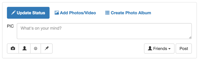
The main feed will now look like this:
The top of the status update entry has three buttons (Update Status, Add Photos/Video, and Create Photo Album), and only one is active at once. We can use Bootstrap’s pills once again:
<div class="panel panel-default">
  <div class="panel-body">
    <ul class="nav nav-pills">
      <li role="presentation" class="active">
        <a href="#"><span class="glyphicon glyphicon-pencil">
		</span> <strong>Update Status</strong></a>
      </li>
      <li role="presentation">
        <a href="#"><span class="glyphicon glyphicon-picture"></span>
		<strong>Add Photos/Video</strong></a>
      </li>
      <li role="presentation">
        <a href="#"><span class="glyphicon glyphicon-th"></span>
		<strong>Create Photo Album</strong></a>
      </li>
    </ul>
  </div>
</div>
For the input box with picture to the left, we can use Bootstrap’s media object again.
The status update input box lets the user input multiple lines of text. There’s
only one HTML element that provides this functionality:
textarea.
Add the following after the pills:
<div class="media">
  <div class="media-left media-top">
    PIC
  </div>
  <div class="media-body">
    <div class="form-group">
      <!-- rows="2" means "display the textarea as 2 rows high". The user can
           enter more than 2 rows of text. -->
      <textarea class="form-control" rows="2"
	  placeholder="What's on your mind?">
	  </textarea>
    </div>
  </div>
</div>
Notice that we didn’t make a grid inside of the status update entry. Like Bootstrap panels, the pills and the media object expand to fill the width of the status update entry, so they will appear on separate lines. Adding a grid wouldn’t harm anything, though, and would result in the same visual look.
The bottom part of the status update entry contains buttons on the left, and buttons on the right. We can re-create this using a grid row, with one cell pulled right. Add the following just after the media object:
<div class="row">
  <div class="col-md-6">
    <div class="btn-group" role="group">
      <button type="button" class="btn btn-default">
        <span class="glyphicon glyphicon-camera"></span>
      </button>
      <button type="button" class="btn btn-default">
        <span class="glyphicon glyphicon-user"></span>
      </button>
      <button type="button" class="btn btn-default">
        <span class="glyphicon glyphicon-heart">
        </span>
      </button>
      <button type="button" class="btn btn-default">
        <span class="glyphicon glyphicon-pushpin"></span>
      </button>
    </div>
  </div>
  <div class="col-md-6">
    <div class="pull-right">
      <button type="button" class="btn btn-default">
        <span class="glyphicon glyphicon-user"></span>
		Friends <span class="caret"></span>
      </button>
      <button type="button" class="btn btn-default">
        Post
      </button>
    </div>
  </div>
</div>
The status update entry will now look like this:
The little triangle in the corner of the textarea lets the user resize the
textarea, which is not something we want. We can solve this with CSS. The resize CSS property
dictates the textarea’s resizeability.
The border should also be moved off of the textarea and onto the element
containing it. The textarea also has a shadow that should be removed.
Add the fb-status-update-entry class to the panel containing the entire
status update entry. Now we can use CSS to solve our problems:
.fb-status-update-entry textarea {
  resize: none;
  /* Needs to be !important, since Bootstrap sets this elsewhere. */
  box-shadow: none !important;
  border: none;
}
.fb-status-update-entry .media {
  border-top: 1px solid lightgrey;
  border-bottom: 1px solid lightgrey;
  /* Adds whitespace between bottom border and buttons */
  margin-bottom: 10px;
  /* Adds whitespace between top of media object and top border. */
  padding-top: 5px;
}
The status update entry form is now complete!
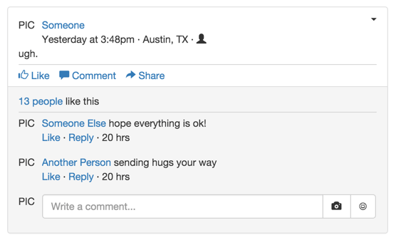
A status update itself has a more complicated structure:
We can reuse many of the Bootstrap components we’ve already described earlier.
First, we can use a grid for the top of the status update, with a media object
for the picture / post time/date information. Note that we’ll have to use
pull-right on the cell containing the down arrow, so it appears on the right
side of the status update:
<!-- Status update #1 -->
<div class="panel panel-default">
  <div class="panel-body">
    <!-- Post metadata -->
    <div class="row">
      <div class="col-md-10">
        <div class="media">
          <div class="media-left media-top">
            PIC
          </div>
          <div class="media-body">
            <a href="#">Someone</a>
            <br> Yesterday at 3:48pm · Austin, TX ·
			<span class="glyphicon glyphicon-user"></span>
          </div>
        </div>
      </div>
      <div class="col-md-2">
        <span class="caret pull-right"></span>
      </div>
    </div>
    <!-- Post content -->
    <div class="row">
      <div class="col-md-12">
        ugh.
      </div>
    </div>
  </div>
</div>
For Like/Comment/Share, we could use a button group… but on Facebook, they look more like regular links. A better option is an inline list; we can make an inline list of links:
<div class="row">
  <div class="col-md-12">
    <ul class="list-inline">
      <li>
      <a href="#"><span class="glyphicon glyphicon-thumbs-up">
		  </span> Like</a>
      </li>
      <li>
      <a href="#"><span class="glyphicon glyphicon-comment">
		  </span> Comment</a>
      </li>
      <li>
      <a href="#"><span class="glyphicon glyphicon-share-alt">
		  </span> Share</a>
      </li>
    </ul>
  </div>
</div>
The content below the Like/Comment/Share links has a different background. Bootstrap panels can have a footer with a different background (by default, a similar shade of grey).
The “Like” information can be a simple grid row, and the comments section can be a media object list. The “Comment” field can be media object with an input group with multiple buttons.
Put all of that together, and we get the following panel-footer div,
which you should place after the panel-body div:
<div class="panel-footer">
  <div class="row">
    <div class="col-md-12">
      <a href="#">13 people</a> like this
    </div>
  </div>
  <ul class="media-list">
    <li class="media">
      <div class="media-left media-top">
        PIC
      </div>
      <div class="media-body">
        <a href="#">Someone Else</a> hope everything is ok!
        <br><a href="#">Like</a> · <a href="#">Reply</a> · 20 hrs
      </div>
    </li>
    <li class="media">
      <div class="media-left media-top">
        PIC
      </div>
      <div class="media-body">
        <a href="#">Another Person</a> sending hugs your way
        <br><a href="#">Like</a> · <a href="#">Reply</a> · 20 hrs
      </div>
    </li>
    <li class="media">
      <div class="media-left media-top">
        PIC
      </div>
      <div class="media-body">
        <div class="input-group">
          <input type="text" class="form-control"
			     placeholder="Write a comment...">
          <span class="input-group-btn">
            <button class="btn btn-default" type="button">
              <span class="glyphicon glyphicon-camera"></span>
            </button>
            <button class="btn btn-default" type="button">
              <span className="glyphicon glyphicon-heart">
              </span>
            </button>
          </span>
        </div>
      </div>
    </li>
  </ul>
</div>
The status update is nearly complete, but is missing two separators:
- between the update text and the buttons
- between the “Like” count and the comments
We could accomplish this with a border, but an even easier solution is to use
two hr elements.
Add an <hr> element between the row containing the status update tet, and
the row containing the button groups. It does not need to be placed inside
of a grid row. Add the second <hr> element between the row that contains
the like count, and the media-list.
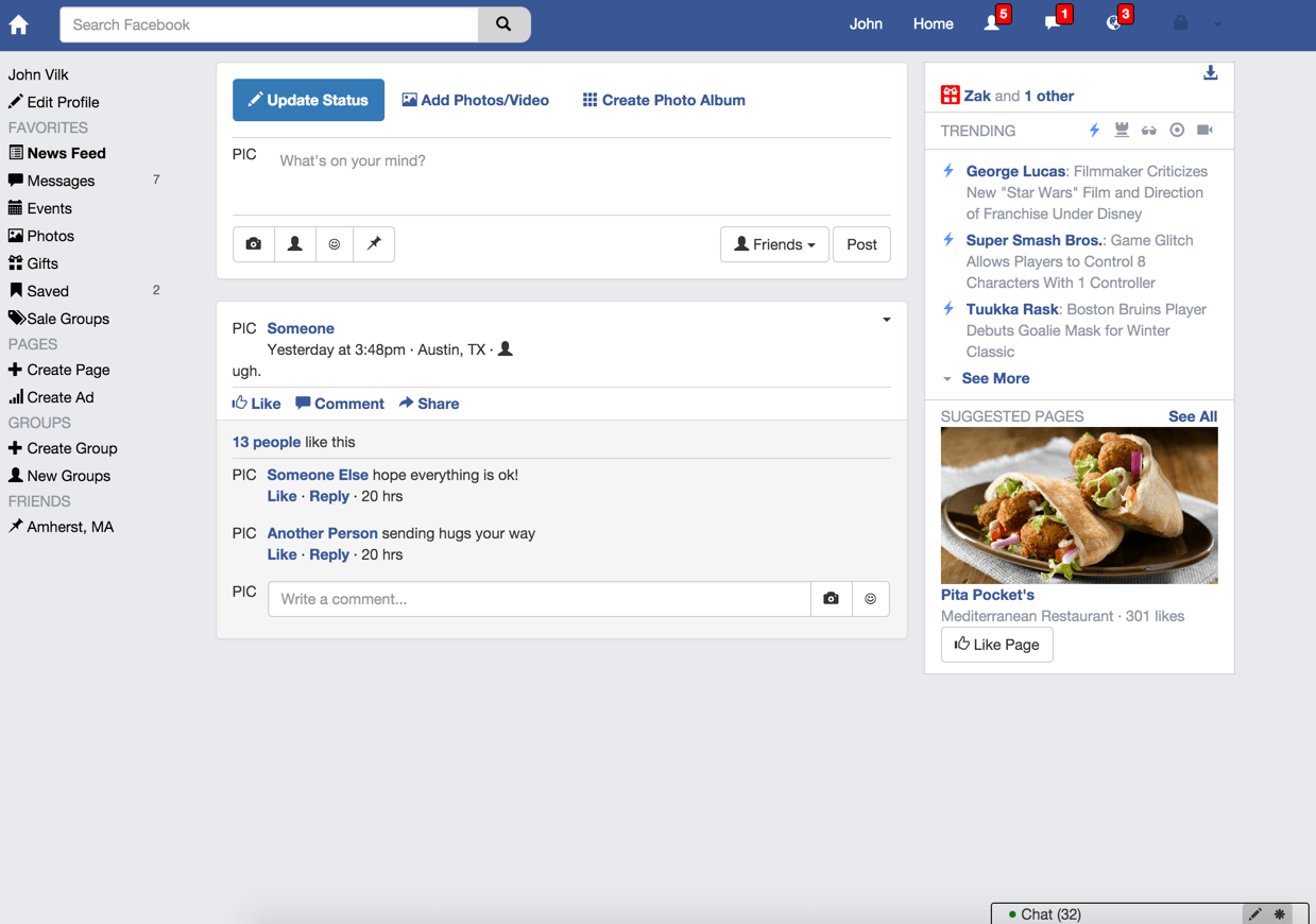
Your status update should now look like this:
The size of the hr elements is spot-on, but the color is too light and it
adds too much whitespace. We can customize this behavior using CSS.
Add the class fb-status-update to the panel div containing the status
update, and then add the following CSS rule:
.fb-status-update hr {
  margin-top: 5px;
  margin-bottom: 5px;
  /* The color of `hr` is set by its top border color.
     Yeah, it's weird. */
  border-top: 1px solid lightgray;
}
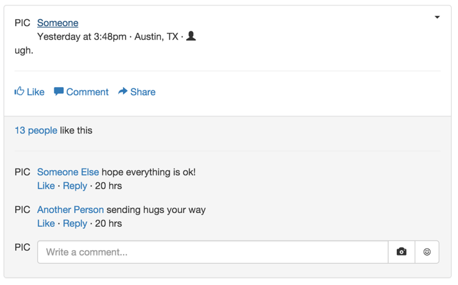
The borders now look much better:
Now, there’s too much whitespace between the Like/Comment/Share links and
the Like counter. If you use Chrome’s Inspect tool, you’ll see that
it comes from the bottom margin on the list-inline class, and the bottom
padding on the panel-body class.
Reign those in using these two CSS rules:
.fb-status-update .list-inline {
  margin-bottom: 0px;
}

.fb-status-update .panel-body {
  padding-bottom: 5px;
}
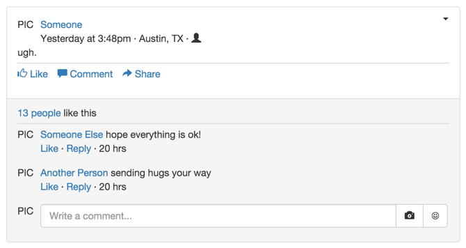
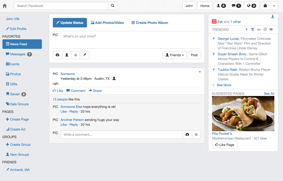
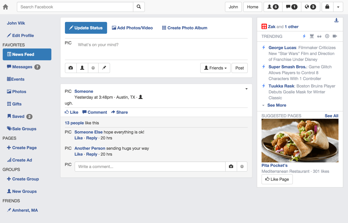
Now, the status update looks great!
We could mock up several different types of Facebook posts (e.g. pictures, videos, events…), but this workshop is already getting a bit long. Consider the main feed complete!
commit your changes with the commit message fb7, and push it to
GitHub`.
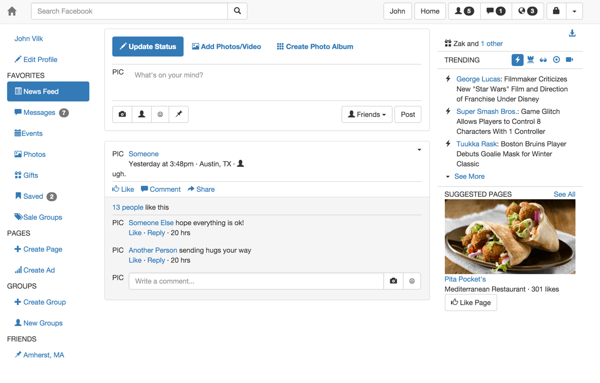
Step 08: Styling
Your Facebook looks kindof like Facebook, but the colors are quite different:
We can improve upon this with a few CSS changes.
First, make the background Facebook gray by modifying our body CSS rule
to change the background-color:
body {
  padding-top: 60px;
  /* I figured out the background color using Chrome's Inspect tool. */
  background-color: #e9eaed;
}
Now, take a look at Facebook… and you’ll notice some problems.
This background change highlights some issues with the right sidebar, which should:
- Have a white background. Right now, it has a gray background.
- Have a small, light gray border. It currently has no border.
- Use gray-colored text. Currently, the text is black.
- Birthday: The present should be white with a red background and round corners.
- Trending: Active pills should be light blue in color with no background, non-active pills should be gray.
- Trending: The lightning bolts next to news items should be light blue.
But we can fix all of these problems with the power of CSS!
Add the fb-right-sidebar class to the col-md-3 div containing the right
sidebar, then add the following CSS rules:
/* Fix background, text, and border of right sidebar. */
.fb-right-sidebar {
  /* Gray text. This is the same color Facebook uses. */
  color: #9197a3;
  border: 1px solid lightgrey;
  background-color: white;
  padding-bottom: 10px;
}
/* Make the birthday icon look more Facebookey.
   It would be better practice to add a custom class to the birthday widget, but
   I'm doing this to make the workshop a little faster. */
.fb-right-sidebar .glyphicon-gift {
  color: white;
  background-color: red;
  /* Sets padding at 2px on all sides at once */
  padding: 2px;
  /* Sets the border radius to 2px for each corner. */
  border-radius: 2px;
}
/* Customize the look of non-active pills in trending widget */
.fb-trending > .row:first-child li a {
  /* Tells the element to inherit the color from its parent. Remember that
     we set 'color' for the entire right sidebar to gray! */
  color: inherit;
}

/* Customize the look of active pills in trending widget */
.fb-trending > .row:first-child li.active a {
  background-color: transparent;
  /* Same color as the lightning bolt */
  color: #5990ff;
}
/* Apply a light-blue color to flash icons *only* in the content
   section of the trending widget. */
.fb-trending > .row:nth-child(2) .glyphicon-flash {
  color: #5990ff;
}
Note: Above, we use the nth-child pseudo-class. Above, we use it to select the second child row of fb-trending
Now, things are getting closer:
Notice how most of the links on Facebook have a dark blue color, and have bolded text. We can recreate that on our webpage with a single CSS rule!
/* Makes links dark blue, even if they have been visited. (By default, the
   browser will change the look of visited links.) */
a,
a:visited {
  /* The color Facebook uses. */
  color: #3b5998;
  font-weight: bold;
}
Notice how the above CSS selector had a comma (,) in it. Commas lets you apply
a rule to multiple selectors. The above rule says “Bold and color a elements
on the page, and a elements with the :visited pseudo-class”.
What’s next?
How about making the navbar blue and changing the style of its buttons? Facebook buttons are a dark blue, unless they contain a badge indicating pending notifications:

Recall that we added badges to some of our navbar buttons with the following code:
<button type="button" class="btn btn-default navbar-btn">
  <span class="glyphicon glyphicon-user"></span>
  <span class="badge">5</span>
</button>
We cannot easily identify which buttons in our navbar have badges or not using CSS. Badges are a child of the button, and there are no CSS selectors that let you style parent elements with a particular child.
Thus, we need a new CSS class! Add the fb-notifications class to all three of
the navbar buttons we have with badges, and then add the following CSS to
facebook.css:
/* Blue background */
.navbar {
  background-color: #3a5795;
}

/* Make house logo white, even if the user hovers over it */
.navbar .navbar-brand,
.navbar .navbar-brand:hover {
  color: white;
}

/* Remove the background color and border of all navbar buttons. Make their
   color dark blue, like Facebook. */
.navbar button {
  background-color: transparent;
  border: none;
  color: #2e467c;
}

/* Make buttons slightly darker when the user hovers over it, like Facebook
  does. */
.navbar button:hover {
  background-color: transparent;
  color: #22345c;
  border: none;
}

/* Make the button white if clicked on, and remain white after clicking.
   Facebook normally opens up a menu when you do this.
   :active = user is currently interacting with the button.
   :focus = user is currently interacting or has just interacted with the
   button.
   :active:focus = both at the same time
   We have to override all of these combinations, since Bootstrap has separate
   rules for them.*/
.navbar button:active,
.navbar button:focus,
.navbar button:active:focus {
  background-color: transparent;
  color: white;
  border: none;
  /* Removes halo and shadow on button when clicked. */
  outline: none;
  box-shadow: none;
}

/* Search button style -- overrides the above two rules for the search
   button */
.navbar form button,
.navbar form button:hover,
.navbar form button:focus,
.navbar form button:active,
.navbar form button:active:focus {
  background-color: lightgrey;
  color: black;
  /* Make it a bit wider. */
  width: 50px;
  /* Make the border's curve more gentle */
  border-top-right-radius: 10px;
  border-bottom-right-radius: 10px;
  /* Apply a light-grey border color. You can specify colors as names, rgb
     triplets, or hex numbers. */
  border-top: 1px solid rgb(204, 204, 204);
  border-bottom: 1px solid rgb(204, 204, 204);
  border-right: 1px solid rgb(204, 204, 204);
  /* Removes halo and shadow on button when clicked. */
  outline: none;
  box-shadow: none;
}

/* Navbar button style when the button has notifications.
   Apply same style when the user is hovering the mouse over the button. */
button.fb-notifications,
button.fb-notifications:hover {
  color: white;
}

/* Make the Bootstrap badges more Facebook-style in the navbar */
.navbar .badge {
  background-color: red;
  color: white;
  border-radius: 3px;
  padding-left: 4px;
  padding-right: 4px;
  border: 1px solid black;
  /* Offset the badge a bit so it hovers over the glyphicon. */
  right: 8px;
  top: -10px;
}

/* Make the "John" and "Home" buttons white. Would probably be cleaner
   using a CSS class! */
.navbar .navbar-right > .btn-toolbar > .btn-group:first-child button,
.navbar .navbar-right > .btn-toolbar > .btn-group:nth-child(2) button
{
  color: white;
}

/* Make the "John" and "Home" buttons have a dark blue background when
   hovered over. */
.navbar .navbar-right > .btn-toolbar > .btn-group:first-child button:hover,
.navbar .navbar-right > .btn-toolbar > .btn-group:nth-child(2) button:hover
{
  background-color: #2e467c;
}
Now your navbar should look very Facebook-ey:

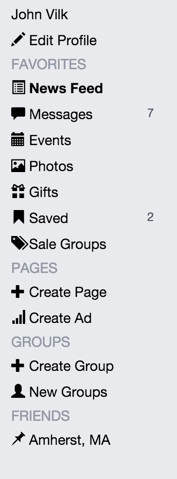
The left sidebar looks very different from Facebook’s:
First, add the pull-right class to the badges beside “Messages” and “Saved”.
That will make those badges appear on the right-hand-side of the listing. Then,
add the fb-left-sidebar class to the div containing the left sidebar so
we can easily style this sidebar in isolation.
The following differences are quite apparent:
- The items are spaced out too much in our list, and should be aligned with
the titles of their sections.
- If you view the items using Chrome’s Inspect tool, you’ll see this is
caused by padding on the
aelement.
- If you view the items using Chrome’s Inspect tool, you’ll see this is
caused by padding on the
- We forgot to add in a space between the Event glyphicon and the “Event” text.
- Whoops. You can fix that in the HTML by adding a space between those two elements. We goofed. :)
- The font color should be black, not blue.
- The badges should not have a background, and should have a dark gray font.
- Section titles should have a dark gray font.
- The “active” pill should have black, bolded text with no background.
- When the mouse hovers over an item in the list, it should have a darker gray background.
We can easily make these changes via CSS:
/* Remove padding between list elements, align list items all of the way to the
   left, and make text non-bolded & black. */
.fb-left-sidebar .nav > li > a {
  padding-top: 2px;
  padding-bottom: 2px;
  padding-left: 0px;
  color: black;
  font-weight: normal;
}

/* Make list items have a darker gray background when the mouse hovers
   over them. */
.fb-left-sidebar .nav > li > a:hover,
.fb-left-sidebar .nav > li.active > a:hover {
  /* This is the color Facebook uses */
  background-color: #dcdee3;
  color: black;
}

/* Override Bootstrap's default style, which changes the color/bgcolor of
   list items when you click on them. */
.fb-left-sidebar .nav > li > a:active,
.fb-left-sidebar .nav > li > a:focus,
.fb-left-sidebar .nav > li > a:active:focus,
.fb-left-sidebar .nav > li.active > a:active,
.fb-left-sidebar .nav > li.active > a:focus,
.fb-left-sidebar .nav > li.active > a:active:focus {
  background-color: transparent;
  color: black;
}

/* Make the badges have no background, a dark gray color, and normal font
   weight (removes bold). */
.fb-left-sidebar .badge {
  background-color: transparent;
  /* The same color as Facebook */
  color: #4e5665;
  font-weight: normal;
}

/* Color all text items in the left sidebar this color gray. */
.fb-left-sidebar {
  /* I got this color from Facebook */
  color: #9197a3;
}


/* The active pill should be bolded w/ no background. */
.fb-left-sidebar .nav > li.active > a {
  font-weight: bold;
  background-color: transparent;
}
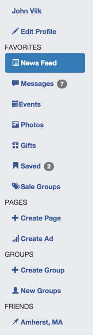
The left sidebar looks much more like Facebook’s now:
We could go on to apply similar changes to the main feed, but we’ll stop here; you probably get the idea by now.
Your Facebook clone should now look like this:
commit your changes with commit message fb8 and push them to GitHub.
Part 2 Conclusion
You did it! You built Facebook! (…well, kind of…)
You learned about:
- Basic HTML, including the difference between inline elements and block-level elements
- The CSS box model
- CSS selectors, pseudo-classes, and rules.
- How to use Bootstrap.
- How to examine webpages using the Chrome Web Inspector in the Chrome Dev Tools.
- How to customize the look of Bootstrap for your application using CSS.
Now you should be ready to try using Bootstrap yourself!
Submission
You must submit the URL of your Workshop3 GitHub repository to Moodle. Visit Moodle, find the associated Workshop 5 activity, and provide your URL. Make sure your Workshop3 repository is public so we can clone your repository and evaluate your work. Note: you are submitting your Workshop3 repository URL to the Workshop 5 activity because this is a continuation from workshop 3.